Fatih Pense's Blog
Analyze a Timesheet Using R
Thursday, February 6th, 2020
Intro
In this post, I use R to answer real-world questions: How can we see clearly the work done by consultants in a time-period? What is the distribution of workload?
Why R vs. others? This is more of a learning experience than a production code for me. I’m not interested in AI/ML at this point. I want to brush up my statistics/probability knowledge. And I believe in focused communities. Python is also great but I would have to filter a lot of information.
You can also achieve the same results using Excel, Apache Superset, SPSS, etc. But I see the R community as a teacher.
For the libraries, I have decided to go with tidyverse collection. I use dplyr instead of data.table. Since I’m just learning the language there is no argument for familiarity, and I think I will have a better understanding next time I look at some verbose/expressive code.
ggplot2 is great and you should check the cheatsheets here: https://github.com/rstudio/cheatsheets
And the guide here is very high quality: https://evamaerey.github.io/ggplot2_grammar_guide/ggplot2_grammar_guide#1
Keep in mind that with ggplot2 you draw a graph layer by layer. If you want to learn the theory behind it refer to the Wikipedia article:
“ggplot2 is an implementation of Leland Wilkinson’s Grammar of Graphics—a general scheme for data visualization which breaks up graphs into semantic components such as scales and layers.”
Code & Charts
Let’s start. This is our example data in an Excel spreadsheet.
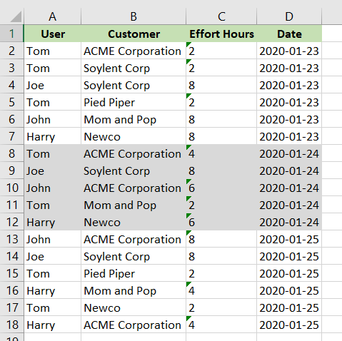
Same data in CSV:
User,Customer,Effort Hours,Date
Tom,ACME Corporation,2,2020-01-23
Tom,Soylent Corp,2,2020-01-23
Joe,Soylent Corp,8,2020-01-23
Tom,Pied Piper,2,2020-01-23
John,Mom and Pop,8,2020-01-23
Harry,Newco,8,2020-01-23
Tom,ACME Corporation,4,2020-01-24
Joe,Soylent Corp,8,2020-01-24
John,ACME Corporation,6,2020-01-24
Tom,Mom and Pop,2,2020-01-24
Harry,Newco,6,2020-01-24
John,ACME Corporation,8,2020-01-25
Joe,Soylent Corp,8,2020-01-25
Tom,Pied Piper,2,2020-01-25
Harry,Mom and Pop,4,2020-01-25
Tom,Newco,2,2020-01-25
Harry,ACME Corporation,4,2020-01-25
Install these libraries:
install.packages(c("tidyverse", "readxl", "lubridate", "ggplot2", "viridis", "hrbrthemes","scales")) Load the libraries:
library(tidyverse)
library(readxl)
library(lubridate)

library(scales)

library(viridis)
library(hrbrthemes)
Import the data and do some clearing:
df <- read_excel("timesheet/example.xlsx")

# You can see columns
names(df)

# Date column has a string class
class(df$Date)

# Convert it to date class
df$Date <- ymd(df$Date)

# This is to have clean names
names(df) <- str_replace_all(names(df), c(" " = ".", "," = ""))

# If Spreadsheet type for column Effort.Hours is String/Text/character
df$Effort.Hours <- as.numeric(df$Effort.Hours)
Let’s see first example:
# Sum Effort Hours for each day
totalhours_by_day <- df %>%
  group_by(Date) %>%
  summarise(
    n = n(),
    Effort.Hours = sum(Effort.Hours)
  )

# ggplot!
ggplot(
  totalhours_by_day,
  aes(
    x = Date,
    y = Effort.Hours
  )
) +
  geom_point(aes(color = Effort.Hours)) + geom_smooth() +
  scale_x_date(breaks = date_breaks("day"), labels = date_format("%d"))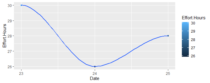
Divide by companies . We will use facet_wrap feature. Each customer will have its own chart!
# Sum for each customer and date, ignoring User
total_by_customer <- df %>%
  group_by(Date, Customer) %>%
  summarise(
    Hours = sum(Effort.Hours)
  )

# month birdview, each customer having its own small graph, thanks to facet_wrap!
ggplot(
  total_by_customer,
  aes(
    x = Date,
    y = Hours
  )
) +
  geom_col() +
  facet_wrap(~Customer, ncol = 5) +
  scale_x_date(breaks = date_breaks("day"), labels = date_format("%d"))
#if your time-interval is long use week for breaks:
#scale_x_date(breaks = date_breaks("week"), labels = date_format("%d"))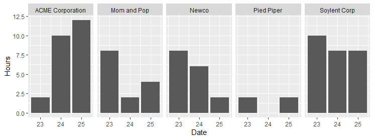
Here the chart gets more interesting. If you need a lot of colors, you should check this site. The easiest way is to copy “HEX json” to an array like below:
total_by_user <- df %>%
  group_by(User, Customer) %>%
  summarise(
    Hours = sum(Effort.Hours)
  )

# If you need distinct colors for a lot of categories/fills. This site is useful:
# https://medialab.github.io/iwanthue/
# Just copy from "HEX json" to here
colors_custom <- c(
  "#e470a3",
  "#9bc761",
  "#9c8fe1",
  "#da924e",
  "#5fcdb2"
)

# Consultant customer diversity & workload
# consultant-customer-diversity-and-workload.png
ggplot(total_by_user, aes(fill = Customer, y = Hours, x = User, label = Customer)) +
  geom_bar(position = "stack", stat = "identity") +
  geom_text(size = 3, position = position_stack(vjust = 0.5)) +
  theme(axis.text.x = element_text(angle = -90, vjust = 0.5, hjust = 0)) +
  scale_fill_manual(values = colors_custom)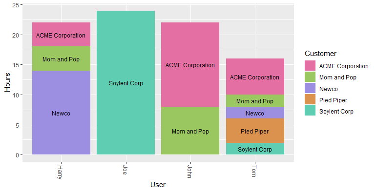
Make your charts beautiful with colors and themes. I use viridis colors with stacked area chart.
Stacked bar chart has problems when there is missing data for x axis. You should fill them with 0.
"complete" function to the rescue!
total_by_date <- df %>%
  group_by(Date, Customer) %>%
  summarise(
    Hours = sum(Effort.Hours)
  ) %>%
  ungroup() %>%
# if you dont fill dates, stacked area chart will have problems.
# you should have all the x axis values for all factors. You can use 0 for empty data.
# complete function is very handy here
  complete(Date = seq(first(Date), last(Date), by = "day")) %>%
  complete(Customer, Date, fill = list(Hours = 0))


# viridis colors are beautiful. If you need <10 colors
# Plot
ggplot(total_by_date, aes(x = Date, y = Hours, fill = Customer)) +
  geom_area(alpha = 0.6, size = .5, colour = "white", position = "stack") +
  scale_fill_viridis(option = "magma", discrete = T) +
  # scale_fill_manual(values=colors_custom) +
  theme_ipsum() +
  ggtitle("Activity by Date and Customers")
# Ref:  https://www.r-graph-gallery.com/136-stacked-area-chart.html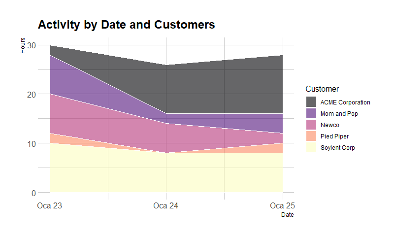
Conclusion
If you only looked at the total numbers you might think Tom is an underperformer. By the way, I think you should never judge a team member/human based solely on numerical data!
Overall I think the most important thing doing data analysis is asking the right questions. It is an art that should be learned with time and should be implemented end-to-end from the data collection to visualization. Good questions lead to beautiful charts that gives meaningful answers!